The thoughts behind our new notes-inserting interface
As you may know we are continuously releasing small changes and hopefully improvements to Canvanizer 2.0. In this post we’d like to share an example of this.
You always have three ways of inserting notes into a canvas:
1.Directly in the canvas: Double-click anywhere in a segment to insert an empty note. This is good for adding short notes with keeping an eye on the context.
2.If you just edited the description of the lowest note in a segment you can press tab and a new empty note will be created directly below (this is also a recent change which you may not have yet stumbled upon).
3.Click the + sign at the top of each segment to make a popup appear. This works well for bigger notes as it keeps you focussed on editing.
This is, how the insert notes popup looked until todays release in the 2.0.
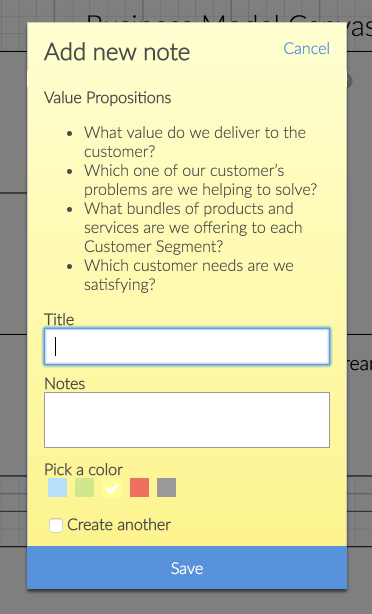
When looking at this during our continuous improvement process, we found that there is much visual distraction going on. We have lots of labels for the input fields. We more or less implemented what worked in the old Canvanizer 1.0 in the 2.0. Now we thought about how we can help you focus on your actual work and make sure that the interface does not get in the way.
This is what we came up with:
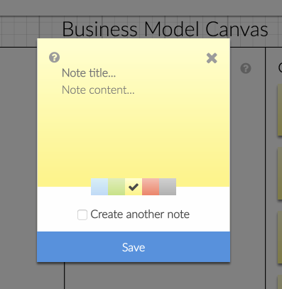
A lot less text to distract. Even the cancel link is now an “x”, which should be self-explicatory. This is the closest we have ever been to the original paper sticky notes. A nice trick for the advanced users: tick the “Create another note” checkbox and you can add lots of note without leaving the popup. A click less every time adds a lot to the overall simplicity of the tool.
But wait: We did not forget about the helpful questions for each segment. They are still available by pressing the “?”. We think there are two distinct usage situations:
1. you’re just about getting to know the template: The questions are a good guidance in this case.
2. You focus on getting the thoughts out of your head and want less distraction.
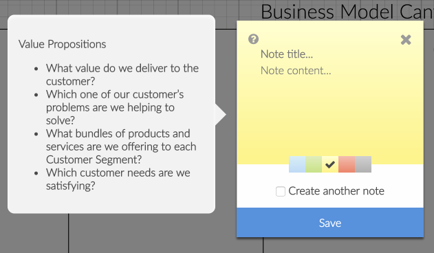
Moving the questions out of the interface and making the display separate as well as optional should work better for both ways.
On a side note (!) we also removed the color from the tutorial hints: The notes with your thoughts should be colorful, not the interface. With the neutral look it should get less in the way.
We hope, this explains a bit the reasoning behind our changes and would love to hear your input as well.
Happy canvanizing!
Update:
And while we were at it, we just added the keyboard shortcut to save the new note directly by pressing “Ctrl-Enter”. If you tick the “Create another note” box and choose any color before this is probably the fastest way to get all your ideas out of your head and quickly fill out any segment.
You can try out everything mentioned in this blog post – even if you are not a premium user of canvanizer 2.0 yet – at https://next.canvanizer.com.
Leave a Reply
Want to join the discussion?Feel free to contribute!