Design Update: A new sidebar for the canvas view
We are constantly revisiting the different areas of Canvanizer and iterate in small steps in the pursuit of always improving. Especially if a piece of the system, the code, or the interface has not been revisited for quite some time this is in itself a motivation to check out what can be done to make things better. And now it was time for the sidebar. We had the old design in place ever since the first beta of the 2.0. Some features icons were added of course, but the main design remained unchained for a long time.
We had a few issues with it:
1. The fold out hamburger menu was not really adding a lot of value that the mouse over hints did not already explain but took up space at the top of the screen.
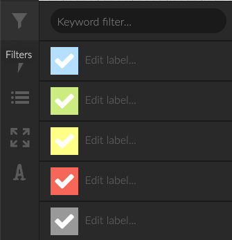
2. Related functionalities were not really grouped together, e.g. Colour filter and Keyword filter were two different icons, due to the fact that they were added later.
3. The fullscreen mode while being a powerful feature for presentation for some reason stayed hidden behind the keyboard shortcut “d f” (for “display fullscreen”) and we are pretty sure that it was not discovered by a lot of our casual users.
4. Some sections such as font size and zoom settings did not feature the most natural interface element for this: a slider but had + – buttons only.
5. For some functionalities we wanted a subtle hint of additional information: An example would be the sharing icons. Since we supported disabling share links if you wanted to restrict canvas access to invited workspace members only, there we now different states (no share link, editable link enabled, readonly link enabled, both links enabled) that did not have a visual representation in the actual canvas view itself, only in the workspace detail view.
6. On smaller resolutions the sidebar was just too long.
So here are some screenshots of where we started and what we came up with. Enjoy and as always, please get in touch with us if you have feedback :-) You can see the new version for yourself in the demo at https://next.canvanizer.com
From left to right: old sidebar, new sidebar, new zoom control and new filter settings:

the old sidebar

the new sidebar

the new zoom interface

keyword filter, color filter and color legend combined

Leave a Reply
Want to join the discussion?Feel free to contribute!