Welcome to the latest update from our team, where we’re excited to introduce a new feature for all desktop users: Flexible Camera Controls. This enhancement is designed to make your interaction with our software more intuitive and efficient, streamlining your creative process.


With this new update, you can now seamlessly navigate through your canvases with simple actions. Simply click and hold the left mouse button, then move the mouse to slide across your canvases. In addition to that, we’ve also improved zooming and added a more intuitive shortcut to it. Just press the Ctrl key on your keyboard while spinning your mouse wheel and you can zoom in and out to get the best view on your notes.

We hope this fluid motion will allow you to explore your projects more effortlessly and keep your ideas flowing without interruption. Alongside these new features, we’ve also spent time fixing some bugs and improving the overall stability and performance of Canvanizer.


We have to admit that it’s been a while since our last update. The last technologie updates took way longer than we expected. However, we’ve returned with renewed energy and a commitment to make Canvanizer the best it can be. Your feedback and thoughts are invaluable to us as we continue to develop and refine Canvanizer.

-> If you have any thoughts, suggestions or feedback, please don’t hesitate to write to us at support@canvanizer.com. Together, we’ll continue to evolve and improve Canvanizer to meet your business needs.

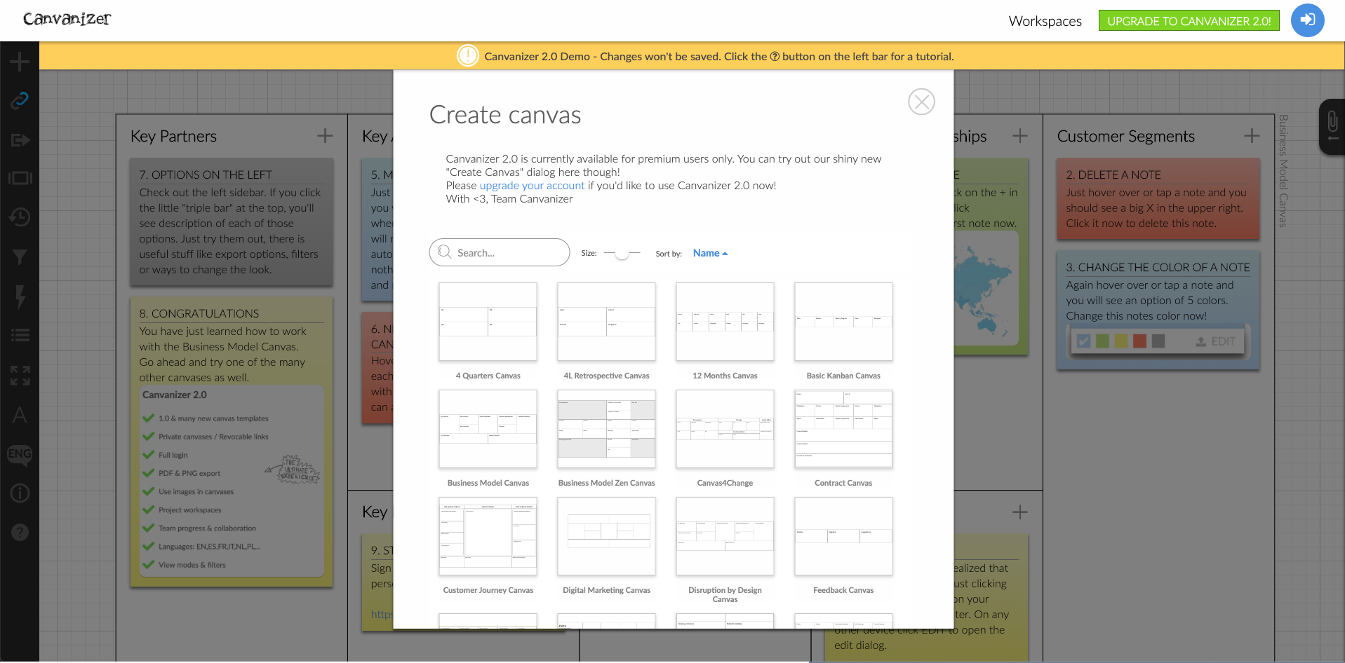
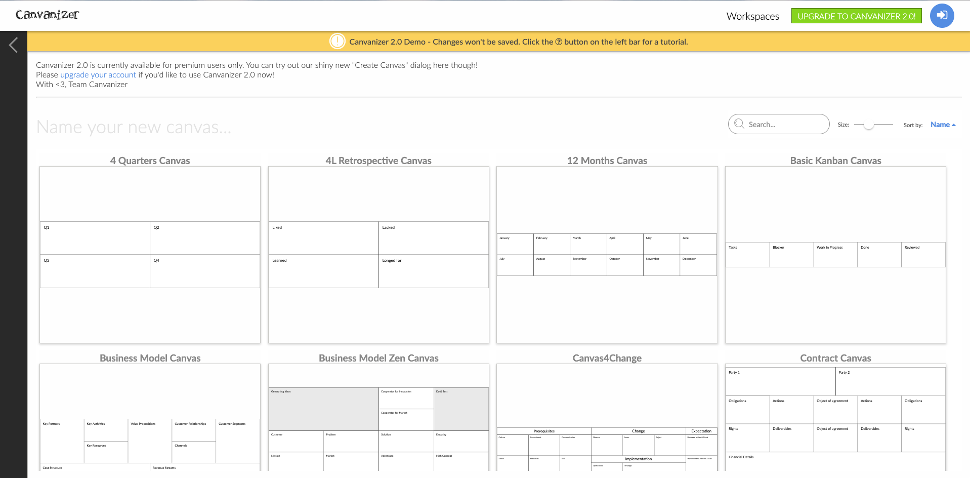
Next in our principle of revisiting areas that have not been touched aka improved in a long time was the new canvas dialog. Either directly from a canvas with the + icon in the left sidebar or from any workspace this is the tool where you browse the available canvas templates and choose which canvas template to create next.

This is the old look:

Previously it was a leftover from a time where we thought, we design everything tablet first. Real world users however suggested, that contrary to the general trend towards mobile, canvanizer is used mainly on desktop devices, the larger the better. This is quite obvious given the fact that on paper canvases span 1 square meter of printed paper regularly. This basically screams for 4k big meeting room screens. Somehow our small canvas choice dialog did not seem to acknowledge that – until now.

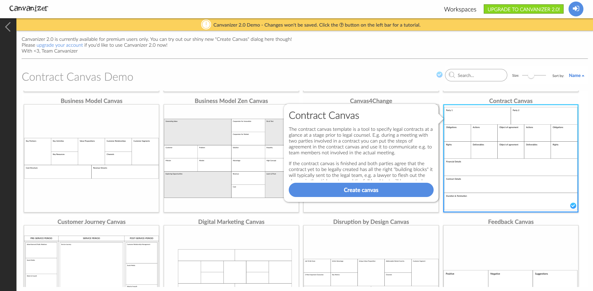
Enter the new design: All the templates in glorious widescreen format:

We have furthermore made the following improvements to the process:

  • the full available screen estate is now used, so the thumbnails are much larger and the segment titles are far more legible
  • there are new size options, from two colums, to three colums, to four colums as well as a new list view. Depending on whether you want to get an overview of the available canvas templates in “browse mindset” or are checking out a specific template before deciding to choose it you can always pick the right preview size
  • Choosing a canvas name is now optional, it will simply get the name of the chosen template and a incremental number. Saves making a choice that will probably revised by you later anyway, since you can simply change the canvas title by clicking on it
  • No more scrolling when you switch back and forth between templates and want to read more info about each
  • And finally the pro user shortcut: double click on any canvas template and voilà, it’s created without further questions in your current workspace…The way to a new canvas has never been easier! We try to keep our interface out of the way to never interfere with your actual work.

We think this is an improvement in every aspect and hope you like it! Have fun canvanizing with all the different templates.

We are constantly revisiting the different areas of Canvanizer and iterate in small steps in the pursuit of always improving. Especially if a piece of the system, the code, or the interface has not been revisited for quite some time this is in itself a motivation to check out what can be done to make things better. And now it was time for the sidebar. We had the old design in place ever since the first beta of the 2.0. Some features icons were added of course, but the main design remained unchained for a long time.

We had a few issues with it:

1. The fold out hamburger menu was not really adding a lot of value that the mouse over hints did not already explain but took up space at the top of the screen.

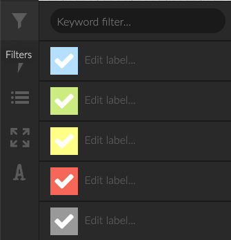
2. Related functionalities were not really grouped together, e.g. Colour filter and Keyword filter were two different icons, due to the fact that they were added later.

3. The fullscreen mode while being a powerful feature for presentation for some reason stayed hidden behind the keyboard shortcut “d f” (for “display fullscreen”) and we are pretty sure that it was not discovered by a lot of our casual users.

4. Some sections such as font size and zoom settings did not feature the most natural interface element for this: a slider but had + – buttons only.

5. For some functionalities we wanted a subtle hint of additional information: An example would be the sharing icons. Since we supported disabling share links if you wanted to restrict canvas access to invited workspace members only, there we now different states (no share link, editable link enabled, readonly link enabled, both links enabled) that did not have a visual representation in the actual canvas view itself, only in the workspace detail view.

6. On smaller resolutions the sidebar was just too long.

So here are some screenshots of where we started and what we came up with. Enjoy and as always, please get in touch with us if you have feedback :-) You can see the new version for yourself in the demo at https://next.canvanizer.com

From left to right: old sidebar, new sidebar, new zoom control and new filter settings:

the old sidebar


the new sidebar

the new zoom interface

keyword filter, color filter and color legend combined

We have added a new optional text field at the bottom of each canvas for your sidenotes. Often when working on a canvas collaboratively there should be a place to provide context that does not belong in either the canvas itself or the brainstorming section. Just hover over the empty space below a canvas in case you need it, otherwise there’s no distraction!

We are now accepting direct credit card payment as well as Apple Pay as alternatives to Paypal so you have the payment option of your choice available when you want to upgrade to Canvanizer 2.0 premium!

We have improved the 1.0 user login aka the free dashboard account so it fully replaces the ‘All your canvases page’ in the 1.0. Also we have added a preview of how your canvases look in the 2.0 for all our 1.0 users. To all the 1.0 users: Enjoy and maybe upgrade :-) To all of our 2.0 users: Watch out for the next new feature that we are currently building :-)

We have just improved the zoom handling of canvases if you are using the built-in browser zoom. Also we thought it is probably clever to remember your chosen font size so we now do this. And some technical improvements below the surface also.

All new canvases will now by default be accessible by team members only, no share links will be created automatically. You can of course turn the links on if you wish, or toggle them so the old ones become invalid and you can send out different new ones. Default is now private canvases with sharing being the decision.

From today Standard users can now choose different fonts for each canvas. Use Permanent Marker for short big notes, the typewriter font for a prototype look and feel or simply switch to Condensed for a higher information density! And last but not least: two different styles of handwriting of course! Enjoy!

A huge and much needed improvement to the Canvanizer 2.0 core engine. All of your
canvases are now loading much faster. Switching between multiple canvases is finally
enjoyable. We are continually updating all areas of Canvanizer and this one is as great
an update as the last one (adding your images to your canvases is also a game changer)
in our opinion. Check it out and experience it yourselves!