New feature: Workspaces 2.0 are released
It is not really a surprise: We love paper canvases. We use them all the time in our workshops. That’s what inspired us to create Canvanizer quite some time ago, out of the pure need to have a tool to allow online collaborative facilitation over a longer period of time. In our workshops it has benefits to work with big printouts of the canvas templates.
A Paper Mind Palace:
And we use the actual physical room we work in to scatter them in different corners. Using space to separate canvases and respective topics does wonders for your imagination. Why not have a crazy ideas collecting corner? A wall dealing with an analysis of the current situation, maybe a wall dedicated to customers, their journey mappings, personas, empathy and so on. You get the gist.
Being able to physically walk to the canvas you are focussing on is the real-world equivalent of a mind palace. We just love this and highly recommend getting up from your desk when you have to think outside the (desktop) box.
From Paper to Software:
Enter software: Canvanizer 2.0 is already much more flexible than the classic version when it comes to filtering canvases to create different viewpoints at any template or quickly undoing it. But this is still not really same as having big big paper canvases – unless you have the luxury of having really large 4k flat screens – in this area we are slowly digitally catching up with paper. Most common use case for Canvanizer is still laptop or desktop use with screen sizes maxing at 24 inch. However zoom, font size switching and colour or text filtering helps to deal with it, it works, albeit the bigger the screen, the higher the resolution the better. Can’t wait to see more adoption of 4k computer screens.
But what about working with several canvases at once? Remember our workshop situation with many canvases visible at once, to allow you to quickly switch where you want to focus on. Even with the existing workspaces it was more or less a “choose one canvas, work with it, then consciously make the switch to another canvas” approach. Especially when revisiting iterations of the same canvas in a grown project was something that our existing implementation of the workspaces in the 2.0 was not really designed for.
This is the background of experience that we kept in mind when thinking about what to change in the next iteration of workspace management in Canvanizer 2.0
Welcome the new workspaces in the 2.0:

We reimagined workspaces from scratch for this new major release of Canvanizer 2.0 that we are happy to share with you now – we just released it and it is available for all our 2.0 users. We are pretty sure about two things: You’ll quickly get used to the new look and feel and will probably forget how it looked before after a few takes of using it.
The version that’s out now is pretty much what we had in mind all the time when we came up with the thought work for the leap to the 2.0 (actually we did this in long walk-and-talks in beautiful summer Stockholm on a holiwork with sometimes 25km strolls per day, sitting down only for note keeping fika-style) but only now got round to spending the time and resources building it.
Always keep the overview before even opening a canvas:

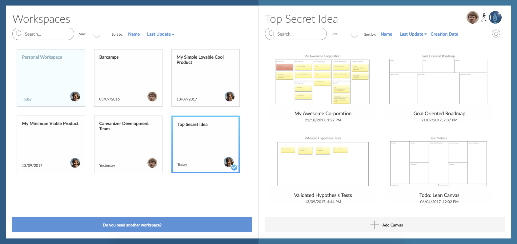
For example: we made it easier to create workspaces and quickly switch between them in a two column layout, allowing to separate parts of a project or iterations, phases or topical collections of canvases into different workspaces. The work with the canvas methodology often means after an initial high-intensity phase of ideation you go out in the “real world” and each sticky note might be a lot of work. When you come back after this phase to revisit (where in the paper world someone needed the wall space and put all the canvases in the dark cupboard, inconveniently rolled together) there is the need to familiarize yourself with all the different canvases and choosing a new relevant set.
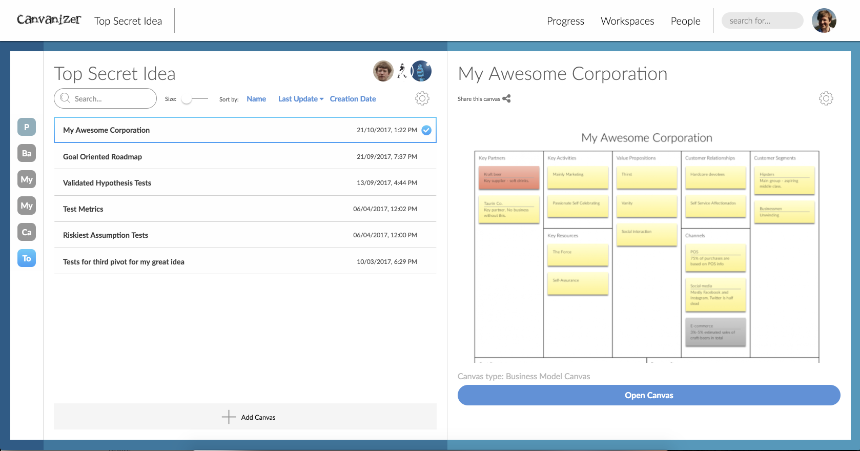
So you need to quickly switch workspaces, check the canvases with big previews, before actually opening them individually and then open several canvases at once. We have that covered: You can also choose the three column layout with big detailed preview of a canvas, all before actually opening it in the canvas view. Want to divide a project into topical sub workspaces with a few canvases each – just a few clicks away!

Collaborate with your team:

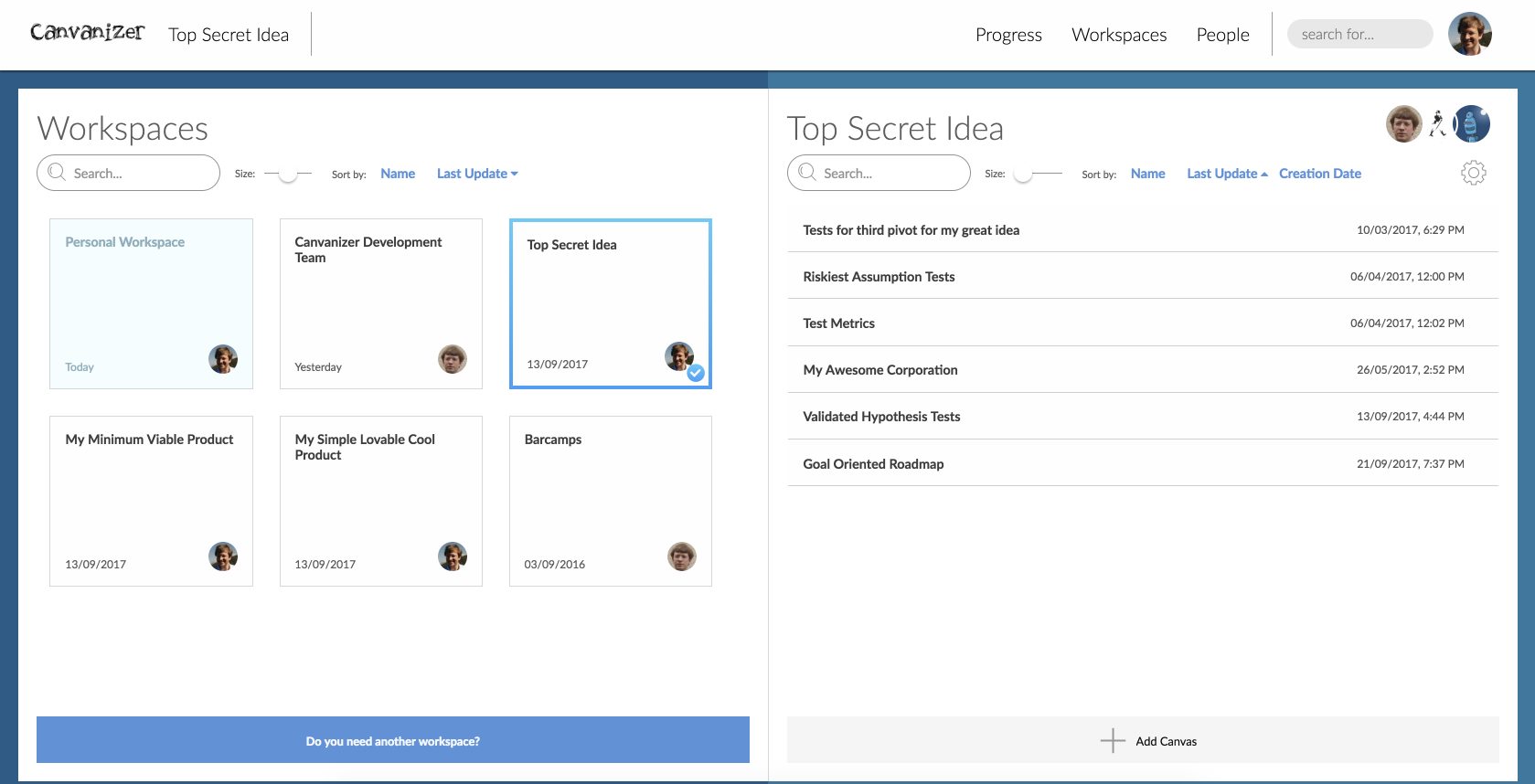
Also it shows that workspaces often end up with quite a substantial amount of canvases, once you have surpassed the initial “I’ll start with one Alex Osterwalder Business Model Canvas” phase – i.e. when you start iterating, ideating across different BMCs, adding other templates and multiply by different point of views or experiments.
So we added different views to allow to adjust the overview level from a few canvases, with big previews, to a grid view down to a pure list view of crowded workspaces. Every view is filterable initially, so when reviewing all experiment boards, just filter by e.g. “exp” (given you named accordingly).
Assigning roles:

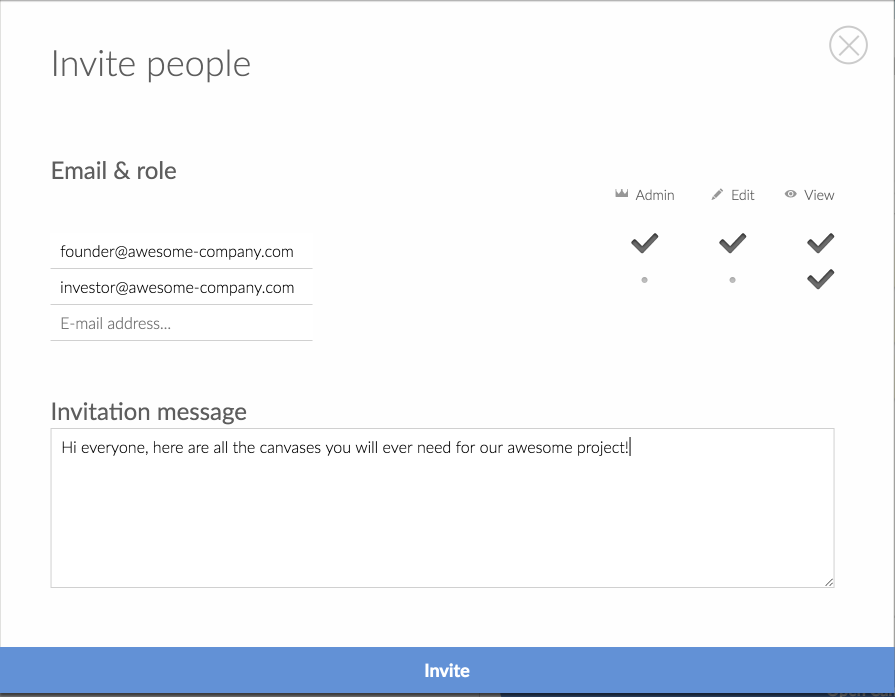
Inviting and assigning roles to your team per workspace has also never been more easily accessible. Just click the avatar icons to make changes. All settings and actions per level are grouped in a gearwheel menu and can be found centrally.

As each 2.0 member is the sponsor of her or his team, they can be invited for free within the plan and don’t need to go premium as well. This also works for non-close collaborators from other environments, so you don’t have to think and count sets but can just invite them.
If you want to share just a few canvases with an open team who might not closely collaborate over a longer period of time, of course you still have the low friction “just share the link, readonly or editable” option as easy as it ever was.
Paper or Software? Both (you guessed probably;))
What we found in our test runs of the beta of the new workspaces that while the benefits of paper and size and tangibility are all still there, using Canvanizer opens up new possibilities that would at least be hard to archieve with paper only. Gathering ideas in separate “forks of an idea”? Your point of view of a project vs. a different approach? Easy: Start from the shared canvas, create two copies in a 15min breakout session, then project each on the wall and you will have a more fruitful discussion then in pure plenum in front of a shared paper board. Or in revising priorities and increasing precision of wording. Or dealing with hard to read handwriting. Or simply changing the colour of a written note afterwards, because after the initial brain dump you now actually know what you would like to use the colours for.
While all this is doable with various paper based technologies, sometimes going digital has benefits even in the “we are all in the same room” situation. In contrast, for remote work or ongoing collaboration, to prevent the familiar “Monday when the picture of the canvas meeting is in the email and just about one note should be changed but doing it is not really pleasant in the image editor…so it remains off-canvas as a reply and might get overlooked” situation, the benefits of software were far more obvious already. So using paper and software in combination really does the trick for us.
We hope you like the improvements we made. We are – as you know us – always open for feedback and would love to hear your thoughts! The workspaces have made a huge step forward, so we are catching some breath and then move on to the next area of focus in our effort to help you working with your canvases and supporting the worldwide canvas movement. Stay tuned, we have been dedicated for Canvanizer in the last six years and what a ride it has been.
Thank you for your mails from all over the world, it’s been our pleasure!
Happy canvanizing!
Stefan
Canvanizer Founder

Leave a Reply
Want to join the discussion?Feel free to contribute!